AI art, daily paintings, fantasy illustration, humor, step by step, how to, storytelling art

Creating Backgrounds with Copic Markers

Abstract lines drawn on YUPO translucent paper by Legion

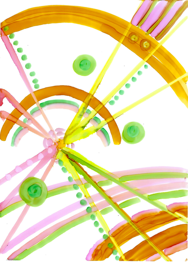
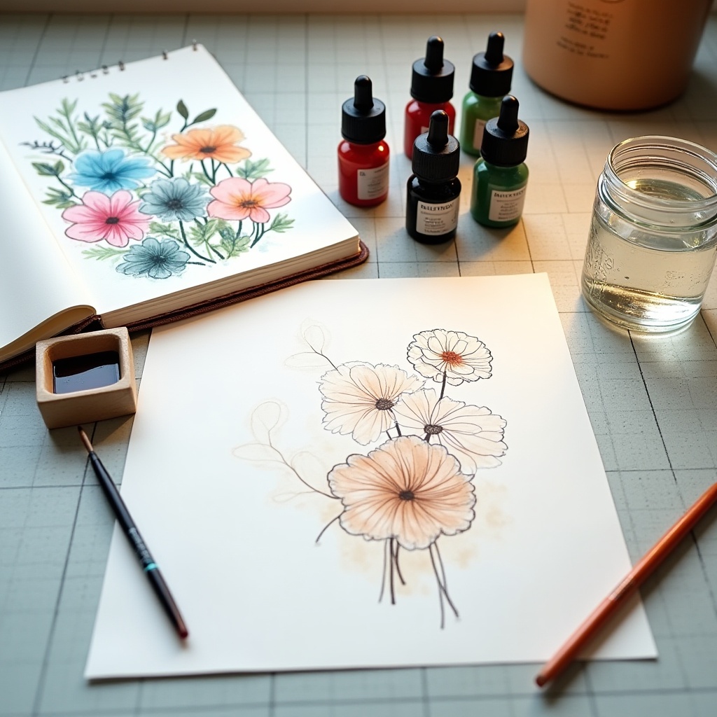
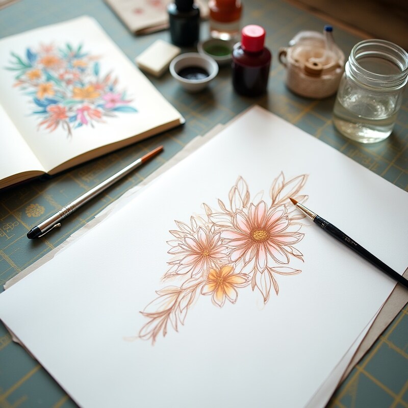
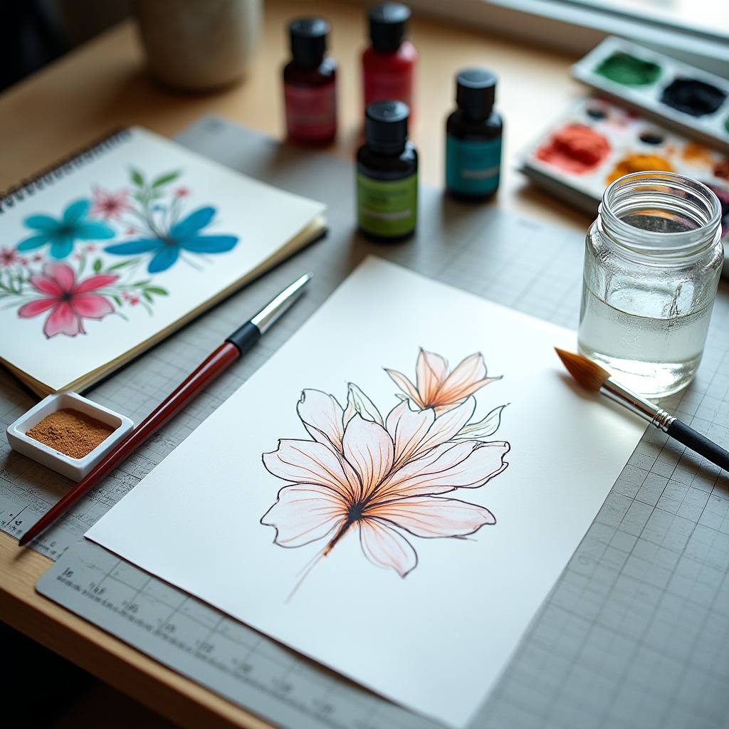
When you use these fascinating markers, aka alcohol inks, you can get lots of effects. When the inks touch each other on the special paper, they can bleed together, repel each other, or you can layer one on top of another, side by side or upsidedown, to create more choices. I usually only use two or three colors because this background will be combined with another artwork.
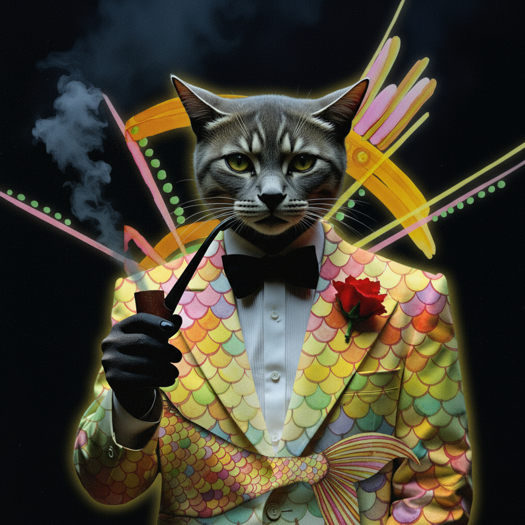
I have been experimenting with making cat characters. Here’s what I used: #1 cat breed #2 a facial expression #3 clothing. I was looking for a combination of all three to come up with a comical character who had a great personality. I chose the grey cat and inserted a pipe for him to smoke. The background was black because I wanted to see the trailing smoke from the cigar. So my prompt included a “CAT SUIT”. For the background, I used the above Yupo sketch. The AI gave me this guy who I kind of fell in love with. Here are a few versions, with a made up text that seemed appropriate. I pictured him running a casino and having a flashy flare….

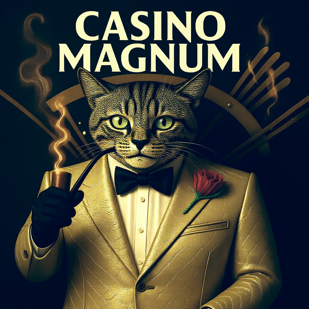
I liked him. I added the Yupo paper background to give it a little art deco style flair. What I especially like is the way the colors blend and compliment each other. Here is another version where I changed his suit and thought he looked like a casino boss. So I gave him a title to advertise his place of business.

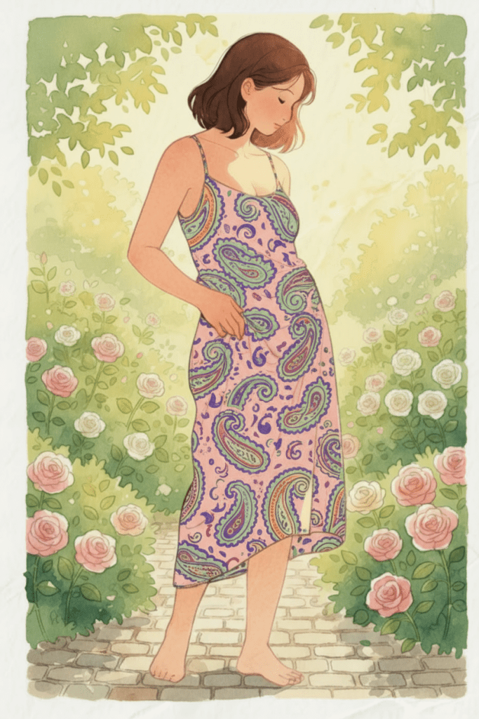
Wow. Look at that personality change. I went through 3 or 4 versions of the fishy suit and decided on this one. I gave the suit a leathery texture and that gave his face a grainy texture as well. Here my Yupo background is very subtle. To my eye it compliments and looks a but moody and mysterious. What a dapper guy. Would you trust him? So I hope you can see that you can create your own backgrounds. They are important because they are individually YOU!

daily paintings, Illustrations, patterns, thoughts behind the work, watercolor, whimsy

Paisley Dress Watercolor

When I started with this image, I had a completely different thing in mind. I wanted to combine 2 or more images together to create something I would be surprised and awed by. When you start to fine tune your ideas in AI, it can easily go many wild ways. That doesn’t mean it’s bad…just different. That’s why this is fun. Here are three images that I put together in a surprising way.
Here’s the first watercolor that I painted from a live model at Clark College in Washington at their evening life drawing sessions–back in 2007. The 1st is the original and the 2nd is one that I just played with some color filtering.

original painting

I added these color tones in photo edit

Here is a watercolor illustration/doodle on watercolor paper I was hoping I could somehow blend into the art, done in watercolor markers.

I asked AI to combine several combinations of the idea of this woman and the illustrated watercolor sketch. Here are the goofy things that happened.
1 They told me I could not have a nude
2 I said, ok but can you come up with the same or similar pose of the woman?
3 They said sure thing, so I chose the girl in the garden among a bunch of images offered.
4 Next I asked if they could put the illustration design on her dress. So I made up a name and called it the “paisley design”.
5 After around half a dozen color changes and getting the pattern to fit her body, I accepted the top design with a few tweeks. I ended up getting the Paisley Dress Watercolor, final product.

This just goes to show you can’t always get what you want….but if you try sometime
you get what you need👌😂

As always, fun unhurtful comments are accepted. Tell me if you’ve had any similar experiences.

AI art

My studio photo modified into AI

I’m having more fun experimenting with taking a real photo and transforming it into an AI image or two. Here is a real photo of my worktable as I’m creating a painting that I did in 2019. As you can see, I love using the crowquill pen, especially with Sepia Drawing Ink. The watercolor in front of me is a reference for possible colors I might use in the new WIP drawing. I love this watercolor. Sometime in the future I’d like to make it into repeatable fabric design.

The following three AI creations are variations from my original real photo. I am fascinated as to how the AI engine can create almost instantly as many versions as I want. If you study closely, you will figure out that my completed background watercolor painting has been transformed to 3 variations….all different versions but with the same color palette. It took me a minute or two to figure out how AI made the transition of the original watercolor to the 3 reference flower art in the background. Each one is different and I just love that. They have similar shapes and themes. The last one on the bottom looks like a blue butterfly. All three also have different types of bottles of ink.

Also notice how the 3 AI creations focused on the new originals being drawn with a sharp and clear focus–in contrast to the background which is in soft focus on all the 3 new offerings. Once you choose one or two of your favorites, you can download them to your harddrive and use as you like.

For this little exercise I wanted to show that if you can understand what AI looks for to create your image, you can have better control of the outcome. The other thing to remember is that I have not touched or modified the prompt or style choice from the original prompt. That could generate many, many more options and practical uses.
Every time I do one of these, I realize the choices are vast, but once you get the hang of it, a fast computer and good AI engine will yield tons of material. It can make life easier and I’m all for that. Good luck trying it. I would love to see what you come up with.