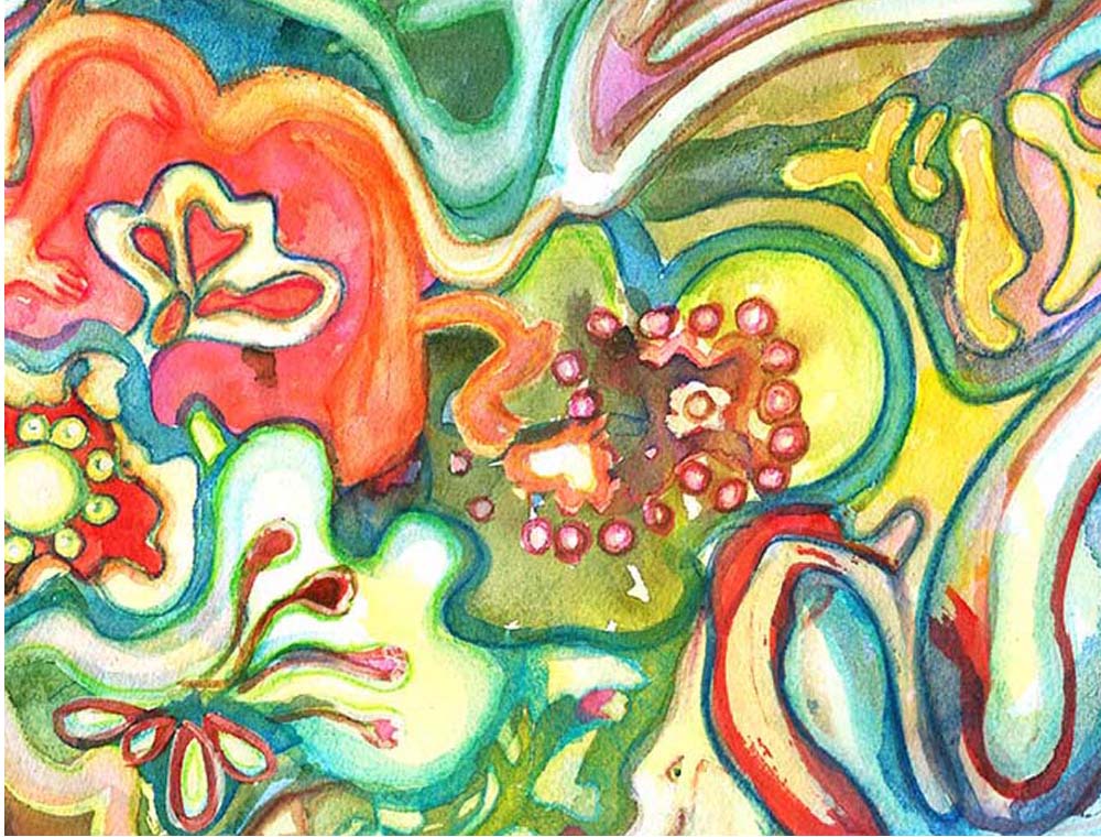
I personally don’t like crowded and/or overworked compositions, so that is exactly what I achieved here. ha ha ha. no joke. I was going for a completely different look but things happen. I began with a gorgeous yellow and blue underpainting with tons of white paper. I drew some lines into it reinforcing some of the big shapes I saw. I experimented and applied a pretty good amount of masking fluid to the whole work, protecting the whites. Then came the first color wash. It looked very stark and cut out and pretty confusing. So I did something new and a little odd.
I softened the white areas with similar colored watercolor pencils. It took a very long time because this is not a small painting. I softened each area a piece at a time. Looking at the photo here, it’s pretty hard to tell exactly where these sections are because they are pretty much everywhere.
I loved the look but it still looked cut out so I glazed various sections with soft washes, trying to push back some areas to accentuate others. It didn’t work and the whole think kept popping up like jack-in-the-boxes everywhere. So here we are with no focal point and a big traffic jam. But there is something compelling about it. It’s a mystery of how color can take over.
I had to stop because there is only so much you can repaint a watercolor before it becomes dead and muddy and opaque. I will continue this technique on the next painting but perhaps only do one shape. I think I don’t even want to count how many are here. I keep seeing this piece as a six foot painting. Even then it would need a huge space to live in since it’s such a bully and attention grabber. I would love your feedback on this one.
Here’s a few versions on products:


You must be logged in to post a comment.