One time in my life I had a rooster who adopted me in CA. He would fly up and sleep in the trees at night. We had a lot of coyotes there. I never made a pen for him because aside from the tons of coyotes around, I had dogs who would love to catch him too. He would come in the mornings and I would leave seed out for him while the dogs were inside. We lived together this way for almost a year. He moved across the mountain a year later to somebody else’s place. I always had a lot of respect for him but felt I could never invite him in…I was sure he would be eaten. What a survivor!
I just ran across these lovely star brushes and wanted to practice using them. This inspirational quote is attributed to a few people but most seem to think it came from 1st lady Eleanor Roosevelt. I’m happy with that. It is certainly true. There are so many quotes to play with, this is only one of many to come. I wanted to put a graphic in here so I did a quick line art of a woman’s face. It was hard to find a place to make her work in the composition. It’s funny how when you begin designing something with the background, the whole piece takes on a “painting” feel. This can be good and bad too because it’s just one more design element to consider. Painting elements take away from graphic elements. It seems like it should be an either or choice to make. That’s why I ended up putting here translucent face on top of text and she ends up being small. Here’s a thought–if you look at the bottom 2/3rd of this artwork it is a square …and the words have an opposite meaning of what the quote is. It would be “women rarely make history”. Ha. Pretty funny. I think these colors work. check it out on tee public.
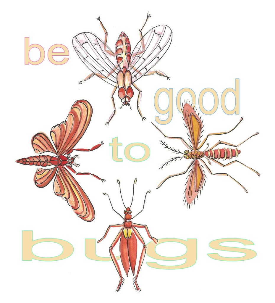
Here are four bugs and some with wings. This is a simple design to draw and I’m not that crazy about some bugs but some are very beautiful. The text is simple Ariel font and each letter is outlined in a different color. The purpose of this exercise was twofold: how to make a design look good on medium range of background colors and 2: hide some of the text so that the viewer does not notice he can’t see the whole thing. enjoy and see it here on different colors
I have redrawn and recolored a vintage comic book page in photoshop. The experiment took a long time and turned out very different than what I had pictured in my head. The line art was drawn in black and I thought I would play and make the shadows with line art as a design element. I colored the illustration using bright colors and brushes that mostly look like air brushes. The bubble texts shapes were done by hand as well. I love the dialog in the bubbles and it is circa 1940’s. The font is “Hello Pencile” which is an art deco style. I think the most successful part of the drawing is the brilliance of her dress. The characters end up having the same hair color. I love her long yellow gloves and orange bracelet. Compositionally, the eye naturally goes to the bottom of the art where there is so much dark towards the activity of all the lines. This was fun. I have listed it on teepublic.
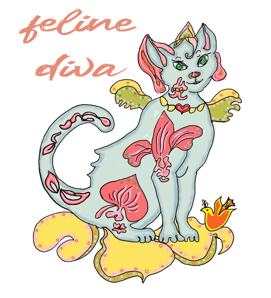
This lovely kitty is very confident in herself. She is sporting huge tattoos of various orchids all over her body. In a more real world, the tattoos would be smaller and molded to her body shape. I have tattoo brushes and I want to do another version with them and it would be a fun piece to experiment with them. Since I have drawn in scratchboard for 30 years, I think the style would be like a walk down memory lane for me. She’s different on all levels too because she is basically a blue girl. I did some remodeling on the sketch by fine tuning the edges. Since it was drawn as a pen and ink and then scanned, it needed to have the background removed so it could be a png file so it could be used printed over many different colors. I took advantage of this necessity to add a few more details since I was at it. I think it would be adorable on childrens’ clothing. The font is a brush font and I thought it would look like a fun companion to the drawing. I did another illustration like this kitty a while ago and I want to redo it with scratchboard/tattoo brushes. I need to find her on my hard drive. Locating art on the hard drive is the hardest thing for me. I have promised to reform my ways to a better filing system. When I switched from a mac to pc, that’s when all the trouble began as that’s when I abandoned using bridge. onward. Here’s the little blue cat on teepublic.


You must be logged in to post a comment.