

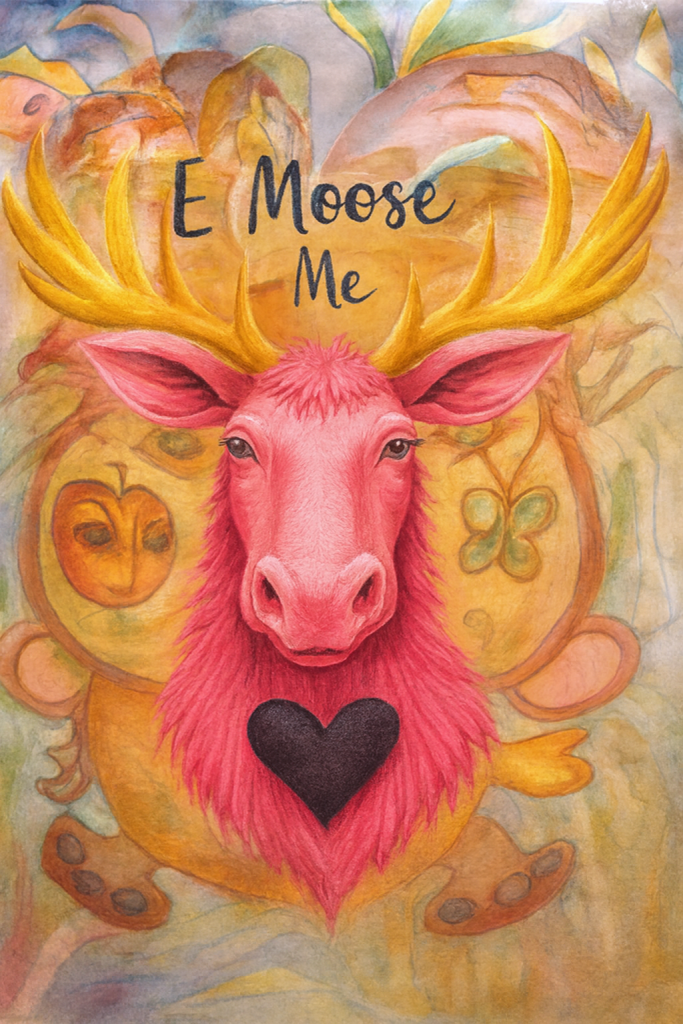
When I started with this image, I had a completely different thing in mind. I wanted to combine 2 or more images together to create something I would be surprised and awed by. When you start to fine tune your ideas in AI, it can easily go many wild ways. That doesn’t mean it’s bad…just different. That’s why this is fun. Here are three images that I put together in a surprising way.
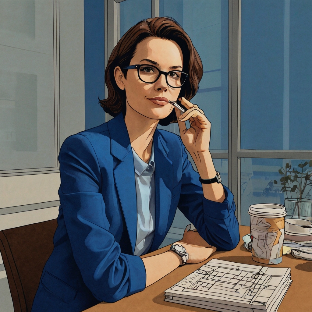
Here’s the first watercolor that I painted from a live model at Clark College in Washington at their evening life drawing sessions–back in 2007. The 1st is the original and the 2nd is one that I just played with some color filtering.
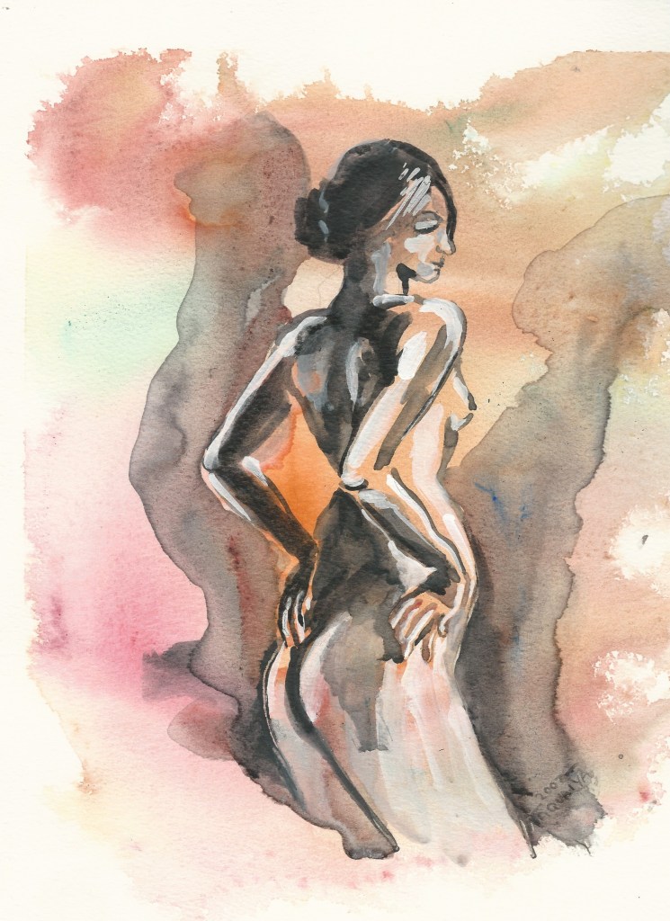
original painting
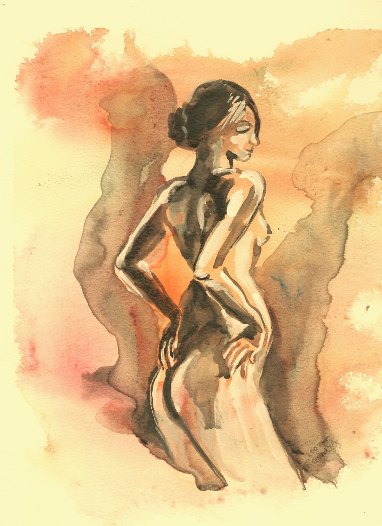
I added these color tones in photo edit
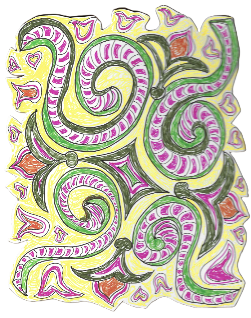
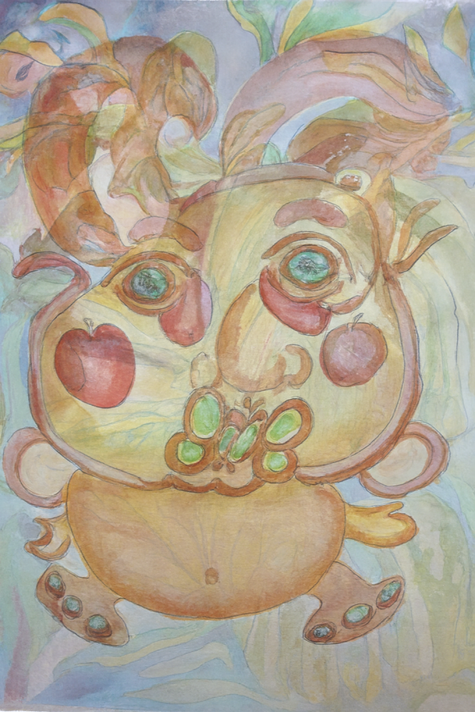
Here is a watercolor illustration/doodle on watercolor paper I was hoping I could somehow blend into the art, done in watercolor markers.
I asked AI to combine several combinations of the idea of this woman and the illustrated watercolor sketch. Here are the goofy things that happened.
1 They told me I could not have a nude
2 I said, ok but can you come up with the same or similar pose of the woman?
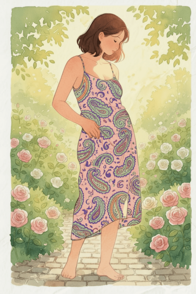
3 They said sure thing, so I chose the girl in the garden among a bunch of images offered.
4 Next I asked if they could put the illustration design on her dress. So I made up a name and called it the “paisley design”.
5 After around half a dozen color changes and getting the pattern to fit her body, I accepted the top design with a few tweeks. I ended up getting the Paisley Dress Watercolor, final product.
This just goes to show you can’t always get what you want….but if you try sometime…
you get what you need👌😂
As always, fun unhurtful comments are accepted. Tell me if you’ve had any similar experiences.


You must be logged in to post a comment.