animals, dogs, Illustrations, simple photoshop, Tablet Drawing

drawing dogs–Fenway

For a while, I’ve decided to do some digital drawings of dogs. This is Fenway and I saw his photo on my friend, Melinda Dalke‘s site. She said ok go ahead and draw him, so here he is. Every dog has a special personality and I thought he was adorable. The way he cocks his head and his eyes are pretty captivating.
This is the first completely digital sketch so I’ve learned a lot about which are the best brushes to use. He has a lot of yellow but in real life his colors are much more subtle. I used hand drawn lines to add a little more texture. Here he is on my products.

alphabet, birds, fantasy illustration, Illustrations, kids, simple photoshop, whimsy

Alphabet letter F

Here is the letter F for the alphabet book I am working on. This fantasy bird is completely created with digital feather brushes. I had a lot of fun doing it and even though it isn’t a popular subject, it’s what I want to do. I picture it as a book in English and Spanish. This could be a complete time sink me thinks. I’m have a habit of doing projects that are too big for me but here goes. This is not a kids’ color palette but that can be changed. I have put it on products as a tester to see what people think of it. Personally, I like it a lot but I’ve been known to be prejudice.

Here it is on some products to have fun with.

alphabet, fantasy illustration, fonts, Illustrations, simple photoshop, whimsy

Original Nymph

Sometimes I see things that aren’t there. When I check and look again, they are gone. I see little creatures in the forest. Here is a little androgynous imp that I found in the cool forest. I have been playing with painting with light and this is a first attempt to use some overlay filters with different opacities. fun. The fonts are JellyBelly for nymph and StrokeDimension for the word original. In both fonts, I have used an additional 2 colors.
If you want to check it out, here’s a link on FineArtAmerica.

Illustrations, scratchboard drawing, simple photoshop, t-shirt design

Playing with the moon outside her gate

I guess you could call this a composite drawing and the category would be surrealist art. That’s ok with me. It is a composite because the Hopi girl with firecrackers is an old scratchboard from years ago.

I masked her and her firecrackers out from the black textured background and got the idea for the gates from a snapshot I took from the tv in an old black and white basil rathbone film of Shirlock Holmes. I loved the moodiness of the view of the foggy atmosphere and the far away landscape in the film.

So I started putting pieces together in photoshop 2018… I just wanted to basically create a mood with the art. It went through a lot of changes. I had an idea in my head of a piece of art where the subject was coming out of the background frame. This turned out differently., Don’t ask me how I ended up with this but that a learning curve for you.
As usual, the problem with this kind of art is that it’s really hard to put into a specific category for commercial use. So when I go to fill out tags for it, the category that came the closest was I’m guessing is surrealistic. Who would buy this and how would they search for it in their tags? I would buy it since I like it but what do I know. I’m prejudice.
Nonetheless, it was fun and fairly quick and turned out completely different than I thought. I’m perfectly ok with that since I would not even do it if it wasn’t fun. Here’s the link if you want to check it out…..

fantasy illustration, Illustrations, simple photoshop, t-shirt design, thoughts behind the work

Love and hot cocoa t shirt designing

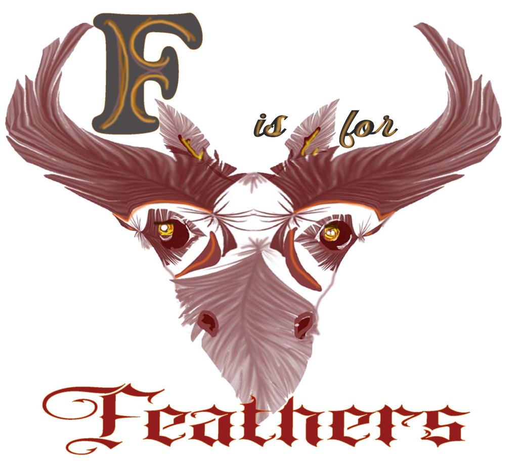
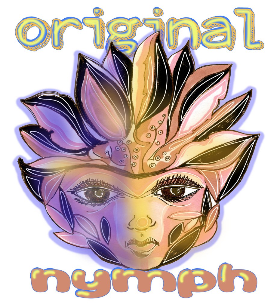
More line art and experimenting with a few coloring details and playing with fonts. I drew this in photoshop and used a quick method of coloring under the line art. This is not the professional way to do it but…I redrew this so many times, I just wanted to finish it. For a comic book the professional way is to make the flats first and then color, and then render.

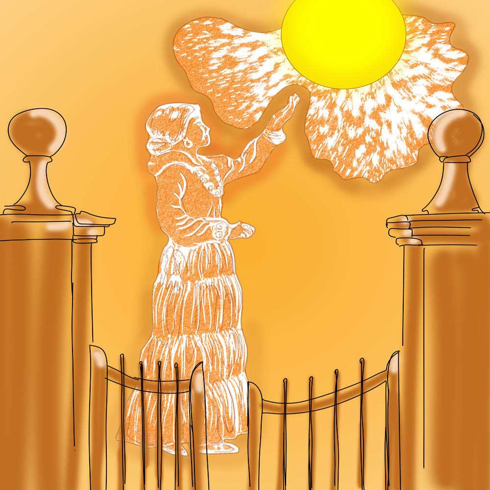
I know this art is pretty flat and there is no light source and no rendering, but…. I wanted something quick to try out a few shades of separate colors to see how they would stand out on their own on various fabrics. I am happy with the four shades of green and the four shades of blue in the fairy’s wings. They do give the art a little depth. I think the shades could have been a little stronger with each step though. It did load well and you can see a distinction in the colors on all kinds of fabrics. I put a lot of thought into placing a heart above her head to show what she is dreaming about–love. I had one more heart but decided that one was better than two–less is more. The cocoa cup color repeats in her dress. I’m hoping the cup starts to resemble a magic globe that she is dreaming into.

I’ve been studying the art of the tshirt for a while now. Aside from the obvious there is a lot to this medium. I am happy today as I had a lightbulb moment last night, looking at some of my favorite t-shirt artists and making mental notes on their thought processes.

I’m hoping to do this again and to see if I can build up a little speed. Another note is that the text and image can’t have much space between them because when it’s printed as a sticker, the parts should always be connected. I did color animation cells al long time ago and we had similar issues. fun.

Here’s a link to see the product