

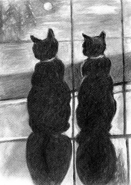
Here is the 3rd and most likely the last version of the 2 cats, best buddies. I have been dreaming about doing charcoal. This one is on watercolor paper and it had too many peaks and valleys in the texture to be good for vine charcoal. I now have a charcoal pad and I will be playing more with the medium.
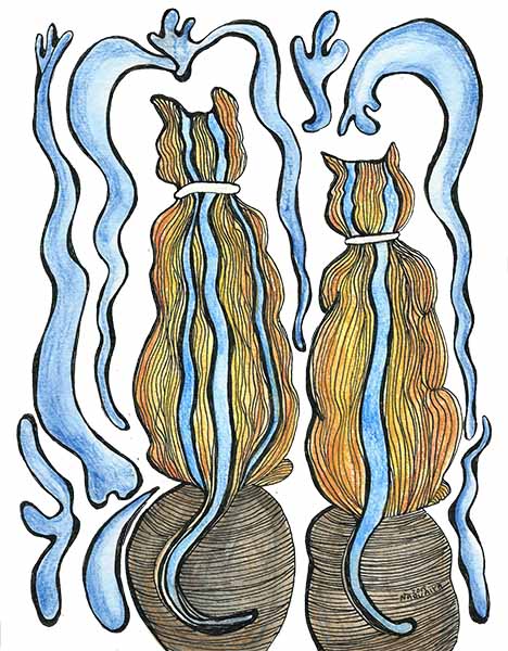
So here are the 3 altogether. I think it is fascinating to draw and paint the same subject from different points of view. The background of course was made up on the spot and I got a kick out of doing it. I love the moon as you can probably tell. It’s in so much of my art.

Here is the charcoal version on a bed blanket


You must be logged in to post a comment.