Illustrations, Pen and Ink Drawing, people, simple photoshop, thoughts behind the work

Toulouse-Lautrec

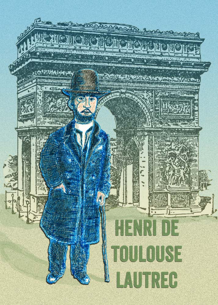
Once upon a time in a city or state I was living in that I can’t remember, there was an exhibit of many original drawings of Toulouse-Lautrec. I had always admired his work but really never known much about his life. The exhibit was downstairs in a kind of basement setting. I remember it was very dimly lit down there to prevent light damage to the art. All the works were small and intimate. This was fascinating as most of us know he painted very large paintings and posters, depicting Paris life and the can can as we know it. This was because he was not just a painter but an illustrator and just as importantly, a caricaturist. The exhibit feature many caricatures of the everyday people in his life.

The drawings seemed to jump off the paper and hit me hard. They hit me in my head, in my stomach and I immediately loved him. I stayed for a very long time, reveling in the idea that when you die, you will not be dead. I had just met a truly great man. The idea grew in my head that If you were born to connect with the history of the world, you would leave something behind. Here in front of me was a little miracle of sorts. This tiny man with his mangled body and his ill fate somehow managed to make his whole life a statement. Tragic though it was, he somehow turned this disabilities into something wonderful people could use as an inspiration. It left a mark on history. He left a permanent mark on me. I hope he will never be forgotten .

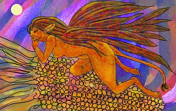
This little drawing was actually two that I put together. I was just learning photoshop and combined the Paris background with the pen and ink. It was a lot of fun to do. I don’t know why but I ran across it in my files and it brought back memories.

It got me to wondering that if you were born with the stack of cards this man was dealt, would you do as well in history or would you be as forgotten as the tiny spec of sand on an ocean shore? Is the world the same now or is it completely different: more cruel, more hostile? Is there more hate and bigotry or is it more exposed? I think it’s the world is the same but the language of survival is different.

animals, dogs, horses, cats, Illustrations, kids, simple photoshop, thoughts behind the work, whimsy

I need to find me a cat, design

find-a-cat-leaves

I am very happy with this drawing.  Maybe things are falling into place with this effort.  The leaves are a watercolor that I scanned and brought into photoshop.  The cats were added in layers in line art and colored in.  Everything was done after that on my tablet. Hey, I only crashed Ps once, and I think that’s because I got distracted with a visitor and had a feeling it would happen.  I was away too long and by the time I hit save, I knew it was too late.  But I did not lose too much as I just had to paint in more of the pale turquoise leaves.  This happened once before for the same reason.  my fault.   ALSO, as  time goes on I will learn how to manage things better and make smaller files.  I am getting more and more comfortable working with text.

This is kind of new territory for me and it’s really been fun. Here is the drawing on products.  and boy this product line is getting bigger every day. what fun!

Let me know what you think about this dear readers.  I would love feedback.  I am getting closer to my goal.

fantasy illustration, kids, simple photoshop, thoughts behind the work

Mischievous Green Critter

green-critter-chalk-web

He was born on a piece of  toned paper, drawn quickly with nu pastels which are a kind of hard pastel sticks.  Very messy.  So he decided to clean up his act and become a 1/2 hand drawn, 1/2 digital critter.  Perfect for him since he never obeyed any rules in the first place.

He works as an undercover green spy and here he is hiding as silly fun.

So as usual, what started out to be a quick little thing, ended up being a project.  That’s ok because it is giving me a chance to use my old Wacom Intuos Pro and improve my photoshop skills,  And I am getting better as saving my png files, using transform tools, brushes and adjustment layers.

Here’s what he looked like when first born….  He needed work obviously but as long as the idea was there, he was a candidate for surgery. ha ha ha

green-critter-chalk-orig

alphabet, fantasy illustration, kids, Revising Old Work, simple photoshop, Uncategorized

a b c alphabet letters

a-b-c.jpg.th

These three little letters were an idea I had a long time ago and I did not forget about them.  I love drawing and sketching little critters and I hope I can get a complete alphabet one day of little marching letters.  When I drew them the sketch had little white feet of some kind and I carried it through here in the photoshop drawing.

alpha-a-b-scrap-th

The red and green above are the original ideas which I managed to save from oblivion.
I love the little legs and I think if I can be consistent throughout the alphabet on treatment of this kind of nice flowing design, white feet, treatment on their heads and eyes especially and the thick and thin variety in the black lines, I hope I may actually have something here.  I did do an alphabet a long time ago and here is one letter done in scratchboard and gold.  I can’t find it right now but it will show up.  It was pretty awesome.

Of course, I know I’m going about this in the wrong way because these should be done in vector in AI and to do them as bitmap in photoshop is pretty labor intensive.  But….I wanted to get the idea down why I still remember it.   Also I have lots of brushing up to do in Illustrator and photoshop is right now easier for me.


fantasy illustration, Illustrations, Revising Old Work, simple photoshop, step by step, how to, thoughts behind the work

Corn Fairy’s Nightly Run

corn-fairy.revised-web

What can I say.  I am working hard trying to figure out what works and what doesn’t work in photoshop digital painting.  I’m still getting layers mixed up and even though I am still scrambled eggs about it, I am so happy to have learned a new thingy in this one.  I found an old abstract painting and brought it in as a background and tilted it, blew it up, changed the levels a lot until I got a nice contrast between the background and my sweet fairy.  With that as a positive, the negative is that I feel I lost an opportunity to paint the corn as it should look in moonlight.  The same can be said about miss fairy herself, although I like her weird hair with the red maple leaves all over it.  I won’t do that again  though because I don’t think it worked.  When you add something and it looks added and is not inspiring, it will always be a dead issue and is better off left dead.  But alas, every time I paint one of these, I get a little closer to getting the concept.

corn-fairy-old wc

This is the old corn fairy from 2005.  I like the idea but I am surely not there yet. All in all, this is the better work but I will meet the challenge of reviving it.  It is always good to save your work.  It is much more rewarding to revise your own stuff that to just grab something off the web.  I love the corn in this and the corn colors. I also think her skin tones are pretty cool.  I may try this whole thing again at some later date.

abstract-milky way-th

Here is the abstract big watercolor.  I changed so much of it –changed the levels and saturation in photoshop.  See if you can guess which little section of this I used and manipulated.  The original painting is misty and washed out just as it looks here because I washed and tried to scrub out what I had painted a long time ago.  Because I used Arches 140lb. cold press, I could not get it all out.  Now I am so happy about that because I can use this artwork for so many digital applications now.  How cool is that?  The other option is that I could paint over it but I think that would ruin it.  So I will leave it as it is: a hidden treasure.