

 Lovely sunny day. Quiet here and wanting to be outside,
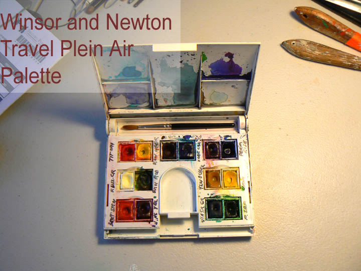
 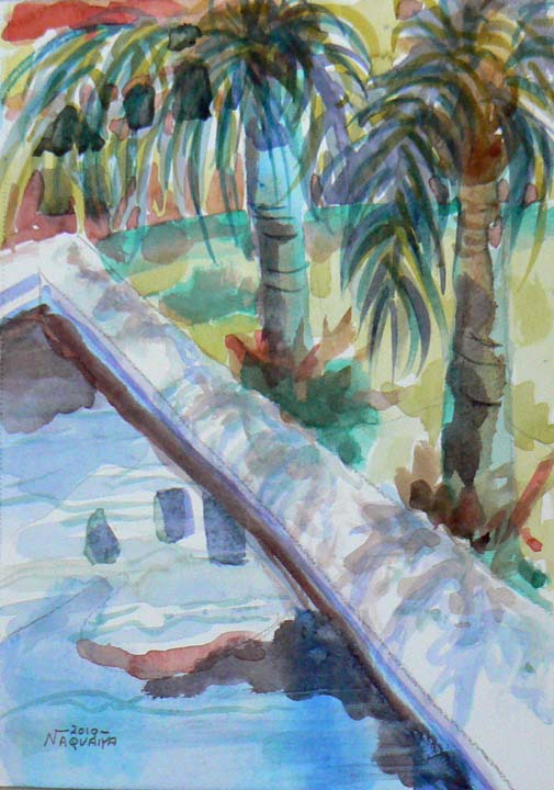 my friend and I set out to spend an hour with our mini palettes and brushes and small watercolor pads. This is the wading pool in my (coto) community. It is complete with great healthy palm trees and singing birds.
It is important and joyful to paint outside. It is a liberating experience. Tiny brush, tiny palette, tiny view of a huge scene. Plein aire paintings are super honest. Perhaps because you have to be quick before the moving sun changes your view.
To purchase prints or textiles, click here
Category: step by step, how to
Little Demo on Scratchboard Drawing
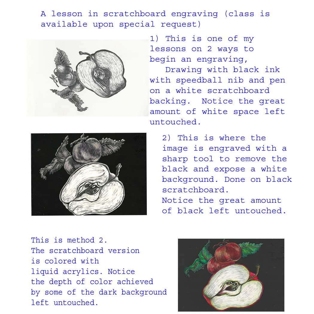
Since I am now using my home base for teaching, I decided to respond to some requests to teach scratchboard and the engraving idea behind it. Although it is not engraved in metal, it offers the very same challenges.
One remarkable quality is that doing large scratchboard is very time consuming and difficult, the opposite is true when in comes to graphic digital reproductions.
This is one of my scratchboard drawings enlarged, which I feel loses zero impact, considering how affordable it is and how it can be applied to metal as well as textile. Click the picture to purchase.
-
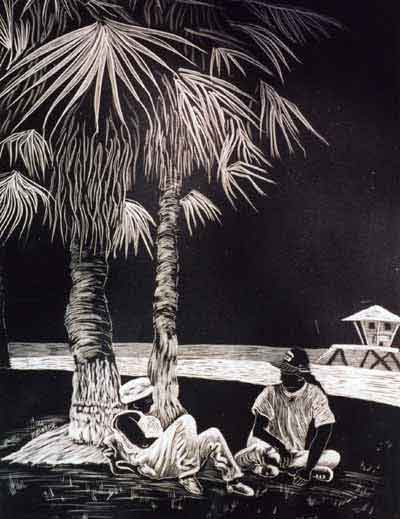
Venice, CA 1997
A red amaryllis
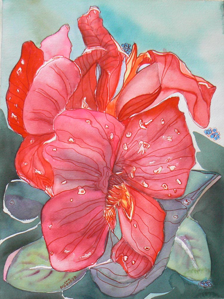 I saw this stunning flower growing out of a very small border garden. I snapped a quick pic with my phone and I found it interesting–mostly because I was amazed that such a beauty came from a meager space. It had just rained and there were some raindrops still on the petals.
When I got half way through the work, I realized my values were so much alike, I was headed for trouble.
I was using a few different reds…from Sennellier Red (the main red) to Alizarin Crimson and a little glazing with Opera. I needed to change something, but I could not figure out what to do.
There was a point where I was very ready to gesso over the whole thing. Instead, I slept on it. Two days later, it came to me what I should do.
I glazed the background petals with scarlet red by winsor and newton. It was so intense and gave me the depth I needed. Problem solved.
The problems we face are only as difficult as those we are up to solving. If we can’t figure them out, it’s perfectly ok to continue and keep moving forward. don’t quit. Take a break. That’s a good reason to blog. I may be talking to myself, but I don’t mind. It’s better than watching t.v.
If you would like a print on paper, metal, canvas or textile, click the image.
Love this hanging chair, in the garden…or anywhere https://www.reformasthlm.se/sv/artiklar/hangfatolj-svart-vit.html
Liz’ Pink Flower challenge
My friend Liz Ozselcuk does beautiful digital photography. She challenged me to play with one of her photos. So this is the watercolor I came up with. This was so much fun. Here’s the step by step of how we are playing with this image.
Liz’ digital photo which was originally as the white flower looked with no changes, then she turned it into this.
Here’s the original white flowers before digital (changes) copy to your browser: https://www.facebook.com/photo.php?fbid=10210656261553030&set=a.1062893142888.2009193.1542778282&type=3
So here’s an explanation of how I did my little painting from her digital change….https://www.facebook.com/photo.php?fbid=10210650477208425&set=a.3348657045557.2120032.1542778282&type=3&theater

Philodendron, step by step
I thought I would try one of these exercises to see if people are interested. I would appreciate input. I am considering doing more of these so let me know if you like it and want more.
Sometimes we can get stuck or bored or get cold feet in how to start a painting. Here is a really fun way to jump in from another angle. These are some underpaintings I did last week,
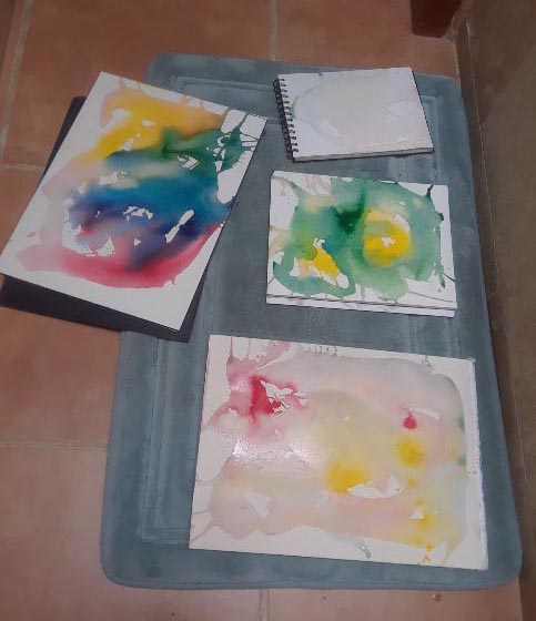
The one with the red splash in the corner is the one I chose this time. What you need to do for these underpaintings is some kind of a permanent color medium. Watercolor will not work because when you go over this first layer, it can lift or blend with your top layer. Lacquer based inks, liquid acrylic or Intense inks are great. For liquid acrylic I like Golden and/or Holbein. They are very rich in color and a tiny amount goes a long way. I happen to have some inks and some Intense colors so I used a little of each. I mixed a dash or two of Intense inks (this is the name brand) with a little water in a small bowl.
Make 3 small bowls–one red, one yellow, one blue. You can use a big brush, a sponge, an eyedropper, or the pour and splash technique. One color splashing for each sheet of paper. Drain, drip or brush off what you don’t want.
I had Arches 130# paper so that’s what I used. The paper needs to be a watercolor paper that is heavy duty enough to withstand getting pretty wet without curling. That’s why I like blocks because all the sheets are glued together and the paper can withstand a beating. Just jump in and have fun and don’t try to control the underpainting too much. Then I just threw the wet blocks on the bathroom floor and waited until the next day to paint.
First off, here is the photo I took of this giant split leaf philodendron while walking to class last week.
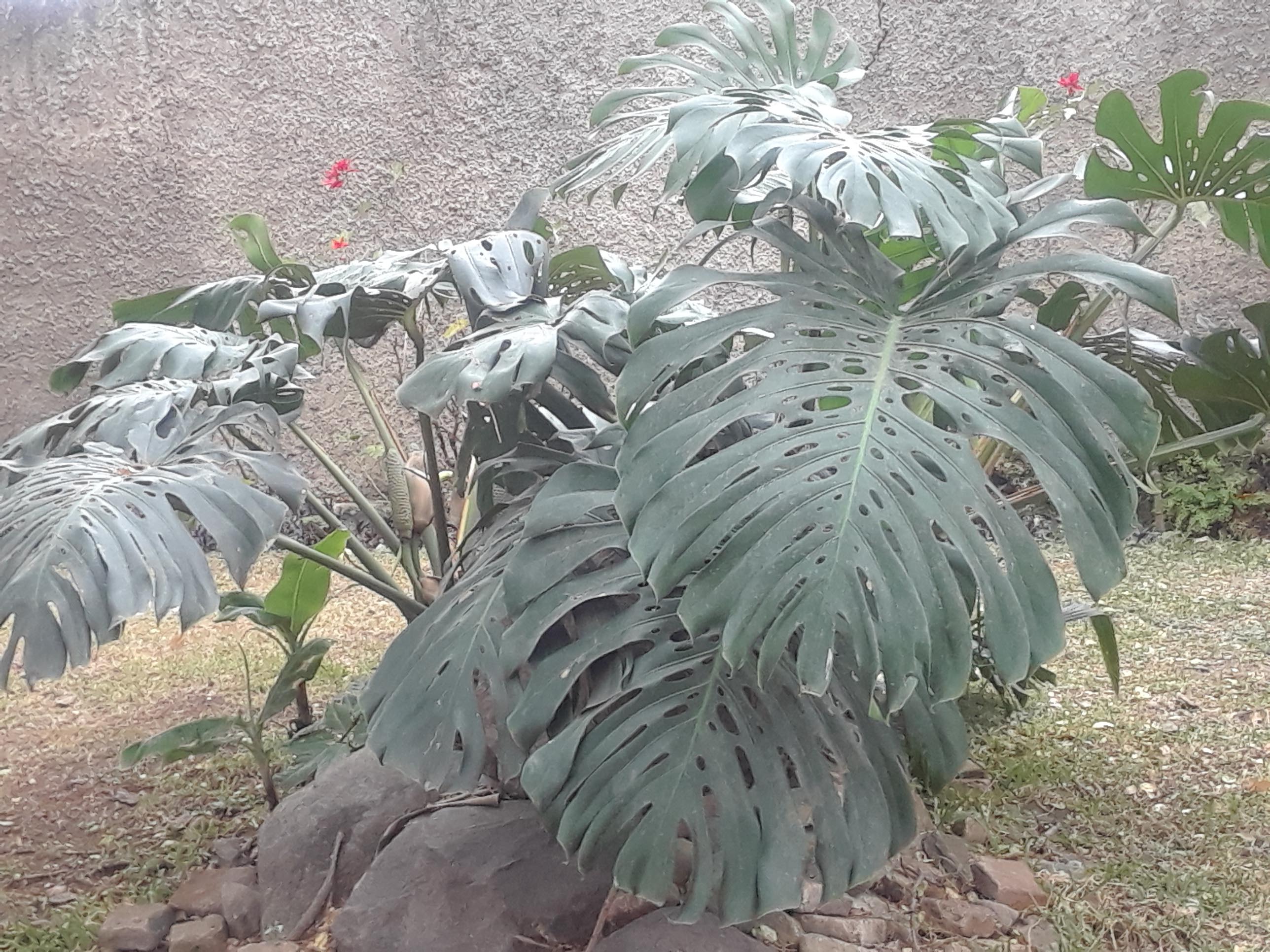 This photo is the color shot right from the camera. You can see here the darks are prominent in the splits of the leaves and in the shadows. The color is drab and very muted. Mostly you get the size of the plant and the basic growing structure. I like the folded leaves because when they fold over, you can see through to the other underneath side. Most of the time you are not sure if it’s the same leaf. That makes it interesting and poses questions. Yes. There’s the storytelling element here.
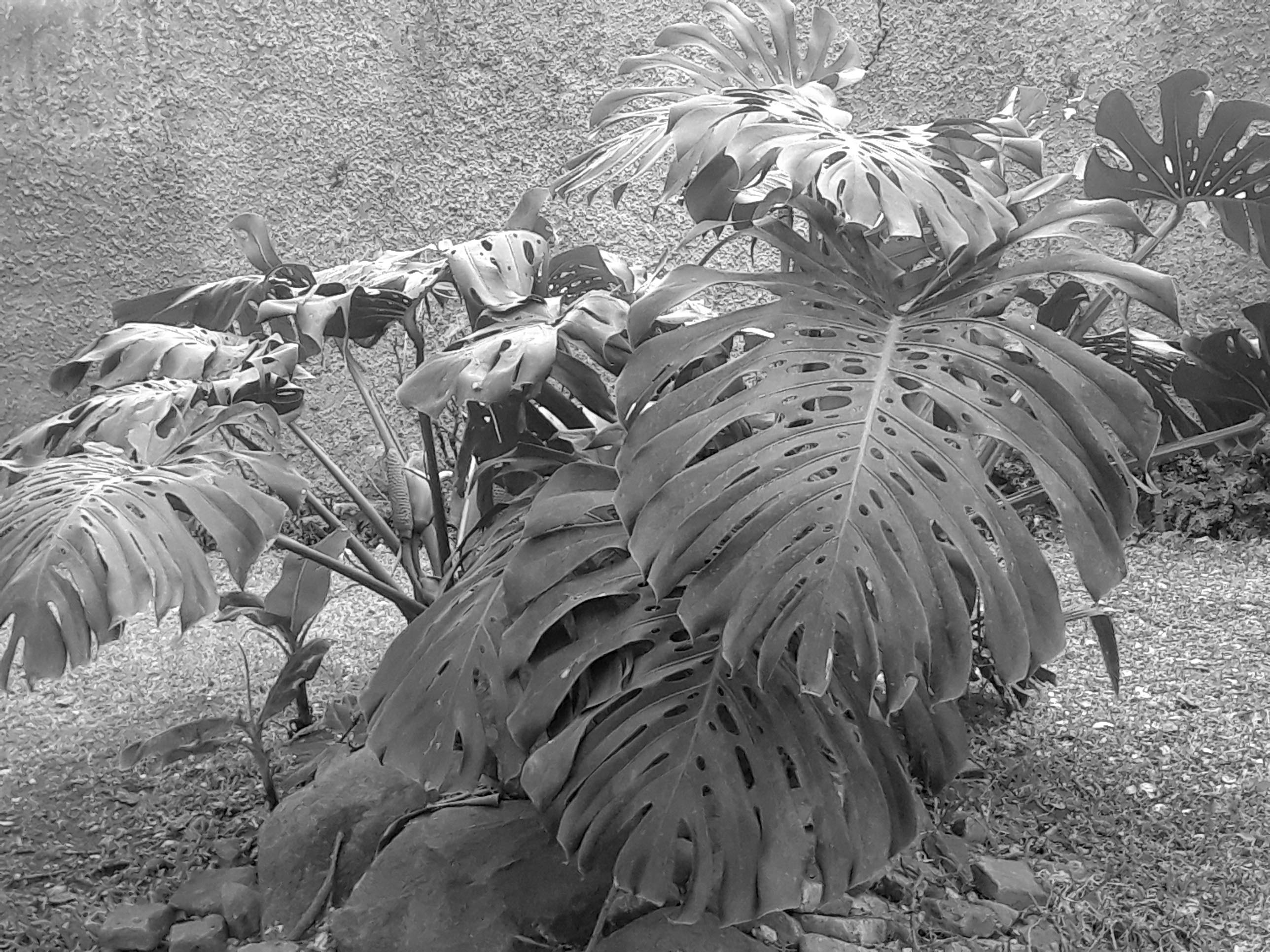

Here is the line art of the plant done with a soft, dark pencil. As you can see, it’s just a sketch that captures (I hope) the simple outlines of the leaves, the splits, and the basic shape of the plant. I thought some details were important, like the tendril type grow on the long stem of one of the shoots. Wherever the reds and yellows landed did not matter to me. There isn’t too much control at this point. But so far, I like it.
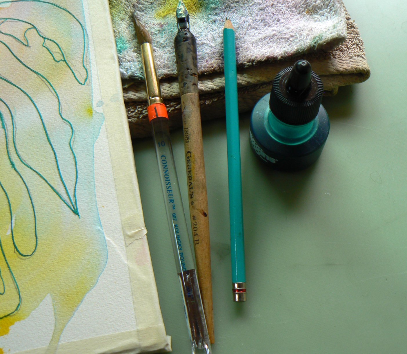
The next step is to ink the pencil lines with my green Higgins ink and my Speedball pen. I have been using the Speedball nibs for 30 years and the most I’ve bought aside from inks are special handles. This is my favorite pen with a cork handle I bought in Portland years and years ago when Utrecht still had a store there. I have a great collection of fine drawing nibs and handles for delicate pen and ink work too, It’s amazing how much ink a Speedball pen can hold and what an even smooth line you can get.
 When the ink is dry, I erase the graphite lines with a good white eraser…aka Magic Rub.
I like Maimeri Blu watercolors, but I also like Holbein and W&N too. I think I like it all. I am anxious to try new ones whenever I can.
I always use a test sheet on a small pad to choose which colors I might use.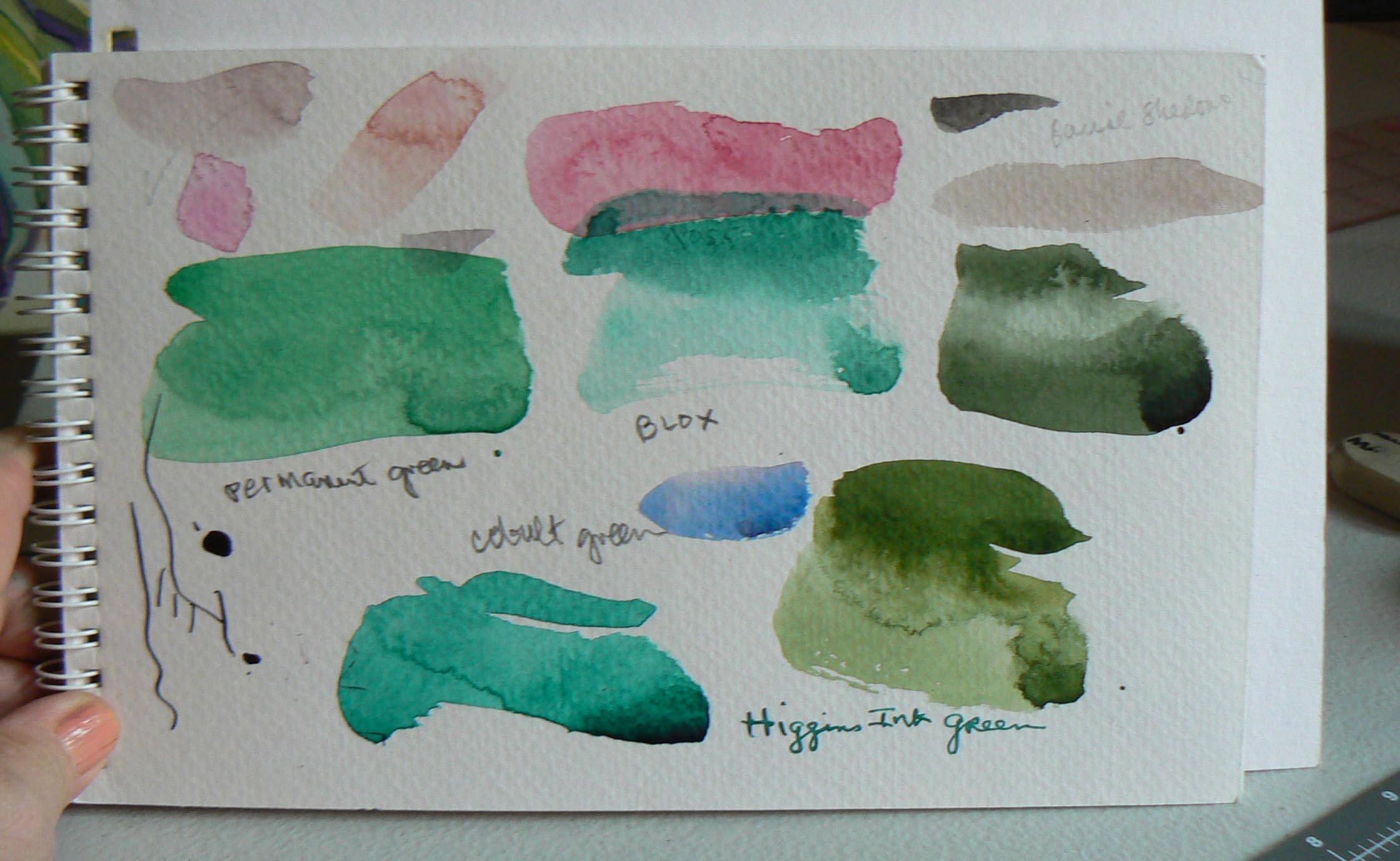
So here is my final painting. It’s first and foremost a design with emphasis on color, shapes and negative spaces. Each color was applied a very small amount at a time with one full and soft brush (see above) the yellows in particular were blended in with the greens. The darks and purples came last. The background turned out to be a mixure of lights and darks.
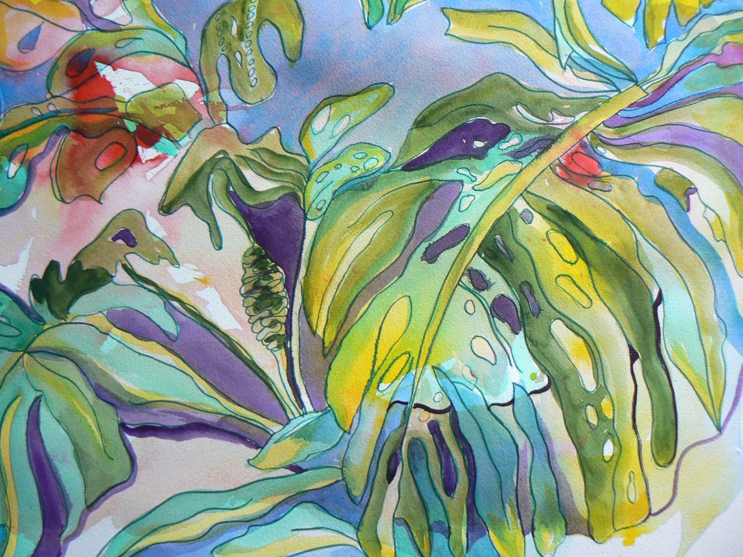
Very little may be compared with the original photo but that does not matter. Once this was completed with both lights and darks in the background and the basic leaf established, I think the best part of this painting is the dancing back and forth of colors and shapes. Primarily, it was lots of fun. But the fun is not really done because…..
I take it another step and can turn it into clothing, or products. I know lots of people shun this. But not everything needs to hang on a wall. Sometimes I like to wear what I draw.

You must be logged in to post a comment.