animals, Illustrations, Nature

Yellow Koi Green Waters

2koi-2020

I’m painting more fish these days.  These koi are imaginary and don’t hold true as anatomically correct.  That is another reason they are a respite from “correct” drawing and are like a little vacation for me.   Koi are valuable and bred for their size and beauty.  How wonderful is that?  I am having fun with this so I’ll let it be.  The original will have some gold leaf to sparkle it up a little.  That is the next stage so for now, this will do.  I will try to remember to post the embellished version when complete.

I used a fine black marker and a fine white ink over the darks to enhance the patterns.  I love painting the deep water with transparent watercolors and tried to use motion and several thin layers to give a feeling of depth.

Here is a print on textile.

fantasy illustration, fonts, people, simple photoshop, step by step, how to, thoughts behind the work

Farmers: An American Experience

farmers-pencil-sketchfarmers-full-text-th

This started out as a pencil doodle.  When I brought it into photoshop, I adjusted the levels to make the greys of the pencil as dark as I could, and the lights as white as I could. This gave me a little template to build the digital painting on.

There is a lot of painting involved here and a lot of colors and brushwork too.  It took a long time.  I am learning to navigate through my Wacom tablet which saves a lot of time. Learning shortcuts is amazing. I wanted the wife to have pears on her dress but they are not joyous colors.  Because of the situation farmers find themselves in, nothing here is joyous.  I hope their expressions reveal what is going on in their lives.

I usually don’t do political drawings but I thought I would have a little fun with this.  It was pretty easy choosing an appropriate font for a title.  I called it An American Experience because there was a PBS series with this name for a long time.  It was a documentary series about cultural phenomena. This font is Goudy Stout.  I love the name and think it’s sounds exactly what it looks like.

My favorite part of this piece are the two types of bodies.  She is a plump pear and he is a skinny dude.  They make a perfect couple that we see in real life just about every day.  Regarding the coloring; my favorite part is his blue jeans.  When jeans get old and worn, they look kind of yellowish/grey sometimes.  There are many layers and tones of the colors on everything here, and I sing the praise of “multiply” brush effects.  It adds so much depth and dimension, as it picks up the colors underneath with every stroke.

An additional treat is that it was saved for web as a png file and therefore it can be printed transparently on to different fabrics.  This piece ended up looking great on lots of textile products and it really surprised me.

Here is what it looks like on a grey sweatshirt product

fantasy illustration, Pen and Ink Drawing, people, thoughts behind the work

Dear Aunt Lydia

aunt-lydea-th

If you have ever had an aunt Lydia, you might enjoy this post.  She is a caricature  from my imagination.  I think she could be in anybody’s life at any time if they were lucky.  I never had one of these, but I actually have been her to some people.  I hope you enjoy this character as much as I enjoyed creating her.

This was all drawn with a speedball nib in an old fashioned pen holder.   I use red ink very often and like the kind they still sell in a bottle.  If you are lucky enough to find some, try it. I have three shades of red ink. Art supplies and yarn have always been my go-to collections. I’m done with books after changing countries, but inks and pens are still small enough to fit in a suitcase.

The original work was the separate oval pen and ink –a highly detailed drawing with a crow quill nib.  The center was another oval I left blank.  I scanned the drawing into photoshop and then layered another red ink drawing of the lady that was done with a heavy speedball nib of Miss Lydia.  I put her into the center and then I just played around in photoshop– tweeking the images to present something unique. She makes me laugh.

After being without Adobe for a few years because my life was so insane, I am back on my computer and can’t wait to do more.  It is so much fun.

If you want to see this in print check out my online store.

animals, Illustrations, interior design, Pen and Ink Drawing, step by step, how to, thoughts behind the work

Rabbit and company, still life, color and black and white illustrations


This process is really long and tedious.  I don’t understand why I am making so much work for myself….except, I started with this idea and I can’t break the mold now. When you have high resolution images, bottom line is that it is what you need to publish your work.

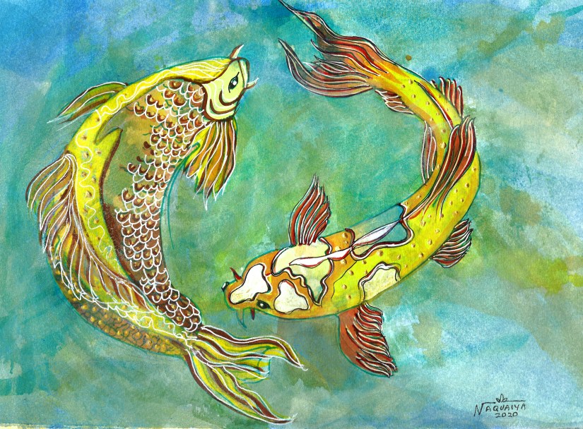
I first do a pen and ink with fine line nib on to bristol paper, which is great for detail.   If I am happy with that, then I transfer that drawing to a heavy watercolor paper.  I am using my 12″x16″ light table to make the transfer.  I am doing this with a thicker nib and heavy emphasis lines are darkened to balance the amount of black on the page.

Then I scan the b&w into a large scanner and upload the b&w to my online store.  When I have the new darker black and white on watercolor paper, I paint it.  The composition defines whether or not I leave a lot of background white in the image or paint it in.

I have been playing with gouache and my usual clear watercolors, which is either Winsor and Newton or Maimeri Blue.  Why do this complex process?  I have learned a lot by this process.  It is remarkable how if you discipline yourself, you can accomplish a lot.  These drawings are giving me a lot of pleasure.  I can’t wait to get to a place when I can assemble them into some kind of storyboard book.

I studied this book building and illustrating in 1988 with Uri
Schulevitz but here I am now, so many years later, actually stepping into scary waters with a style that is actually the first one I adopted such a long time ago.  I discipline myself to doing 3 things every day, studying Spanish, working on the treadmill and drawing and/or painting.  I actually am very satisfied doing these activities.

I hope people will enjoy what I have to say.  My story really never changes.  It’s only the way of telling it that is new.

You can find my art here.

flora and fauna, step by step, how to

A red amaryllis

amarillus-full-webI saw this stunning flower growing out of a very small border garden.  I snapped a quick pic with my phone and I found it interesting–mostly because I was amazed that such a beauty came from a meager space.  It had just rained and there were some raindrops still on the petals.

When I got half way through the work, I realized my values were so much alike, I was headed for trouble.

I was using a few different reds…from Sennellier Red (the main red) to Alizarin Crimson and a little glazing with Opera.  I needed to change something, but I could not figure out what to do.

There was a point where I was very ready to gesso over the whole thing.  Instead, I slept on it.  Two days later, it came to me what I should do.

I glazed the background petals with scarlet red by winsor and newton.  It was so intense and gave me the depth I needed.  Problem solved.

The problems we face are only as difficult as those we are up to solving.  If we can’t figure them out, it’s perfectly ok to continue and keep moving forward.  don’t quit. Take a break.   That’s a good reason to blog.  I may be talking to myself, but I don’t mind. It’s better than watching t.v.

If you  would like a print on paper, metal, canvas or textile, click the image.


Love this hanging chair, in the garden…or anywhere  https://www.reformasthlm.se/sv/artiklar/hangfatolj-svart-vit.html