fantasy illustration, fonts, Illustrations, kids, Odd Little Stories, simple photoshop, thoughts behind the work

Pumpkin House Home Sweet Home

pumpkin-house-HSH-web-th

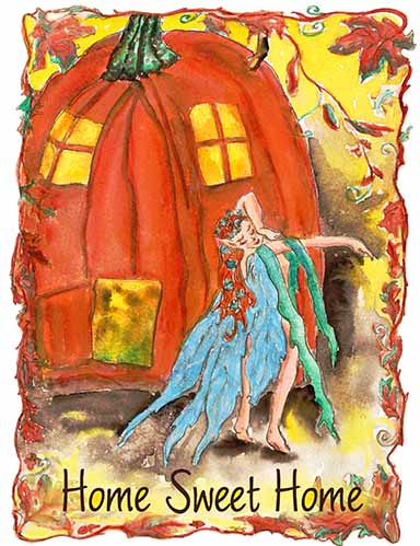
A sweet fairy has a new home.  She dances for joy at the warm light coming from her big pumpkin abode.  Her dress is in tatters and her hair is a mess, but she now has her very own pumpkin.  You can continue to make more chapters to this story.  This is a happy ending for this little gal.  It is a watercolor I did some time ago and it has been forgotten until now.

I used a font called Worstveld Sling…this is the italic version.  I love the simplicity.  It
is very legible and all I did was add an additional stroke.  I laid it on the bottom half of the painting but it was getting lost in some places.  So I made a new transparent layer and tinted some areas with the soft yellow to eliminate the visual clutter.  This took a little time to finish the touch ups on this piece because the edge was kind of raggedy.  I smoothed it over a little with a soft brush of orange to tie the pieces together.  I erased the white background around the border because I wanted the transparency to reveal the cool jagged edge of the painting which I think is very appealing.  I did not want it on a white border.  When  you print on textile, it is very preferable to use the PNG format, so that way you can also put it on different colors of fabrics.

I would like to see this art on a baby’s outfit.  I think that could work.  I am happy with this as I think it’s a good fit of text and subject.  I think this could easily become a story.  Of course, now that I look back it is somewhat autobiographical.  Did you know there are fairies living under logs and in abandoned bird nests?

Here it is on a onesie

alphabet, fantasy illustration, fonts, thoughts behind the work

Going big with small art

kiss-my-command-web-th

This is a small scratchboard that I drew a long time ago as a commission for someone’s wedding anniversary.  It seemed funny and goofy at the time.   I’m using it as an exercise here in working with the text.  I put it against a big black frame and used the new font I just purchased called Nauticus Script Bold.  It just seemed to fit the subject.  I think this works and I’m getting encouraged again.  So maybe I won’t quit exploring text.

I love the way the spaces seem to work together.  It is intriguing.  The words are a pun on “your wish is my command”.  My eye keeps going back and forth between the very even spacial treatment in my command to the wider spacing in your kiss.  I did not adjust the kerning.  I need to think about this more.

The very big image is a new bold try for me.  Here it is on a product.


alphabet, fantasy illustration, fonts, Illustrations, kids, Pen and Ink Drawing

Hammock Lazy Days of Summer

hammock-sketch-full-tulips-th
Hopefully, the last version!

I have revised this sketch so many times and I can’t even stop myself.  chuckle, chuckle.  Sorry folks, I am working hard to get to the next step with my drawings and marketing efforts.  I have thought this over for quite a while and last night I decided this alphabet and text series is not for public taste.  It’s not that people don’t actually like this kind of thing, but I think it’s a non-fit for this on-line store venue.  I can see this idea fitting ….where?  Right now I don’t know but I have all the psd files and I can use them at any time.

Being an artist is hard enough but when you go through a deep learning curve, it is nerve-racking.  I am driven to find a solution to this little dilemma and I am confident an answer will put up its weary head and I will end up smiling.  Every day I am learning and every day new doors open. Moving to Mexico has given me the opportunity to work for as many hours per day as I want to without being distracted by life’s problems.  I love it here and celebrate that I can finally draw, paint and click to the world what is going on in my brain.

I have always walked two paths for as long as I can with my art.  Many have told me I am a traditional painter trying to fit into a commercial world.  YES!  They are correct. I guess I like too many things and want to explore too much.

here’s the link to see the latest version of this drawing.

This is the revision of the first hammock sketch I did using the word “Rest”.  I actually changed a lot of things.  I think it’s much better and it is over-all a lot lighter than the old green version.  So your comments are appreciated and I am listening.  I am trying to be super simple but maintain personality.

Here is the first version using a lot of greens and the text is much heavier in the first version.  I like the new above version much  better.   Comments appreciated.

hammock-web.
the 1st version


alphabet, fantasy illustration, fonts, Illustrations, kids, Pen and Ink Drawing, simple photoshop

A Hammock rests here

hammock-web.

She was reading but my bet is she won’t finish this book and very soon it will gently fall to the ground.  She is looking pretty relaxed with her pet rabbit on her shoulder.  I had a pet rabbit once in Pittsburgh, PA.   This little pen and ink sketch done with black ink on white watercolor paper dates back a few years when I was contemplating writing an alphabet book.  I am sure I had slated it to be H for Hammock but, since I’ve been putting images on kids t-shirts I’m opting for the word “Rest”.  I have a feeling moms would like to rest so I did this for them.  They could think about a little rest when they dress the baby or child.

The font is Lieb Doni and I hope people find it appropriate.  When it comes to fonts, there are so many ways to go and so many choices, it can get confusing. I colored this digitally with my Wacom Intuos Pro tablet and pen in photoshop CS6.  I need to practice using brushes again…it’s been a really long time.   I love using the big brushes and keeping the opacity always somewhere from 30 to 50%.  I’d rather build up layers of transparent color.  I love painting this way.  It is very relaxing.  I think all the black strokes around the hammock are making the whole image a little dark.

I would appreciate comments and critiques.  That’s what I am using the blog for.

Here is the link to purchase.

alphabet, dogs, horses, cats, fonts, Illustrations, kids, simple photoshop, step by step, how to, thoughts behind the work

You’re On a Roll

youre-on-a-roll-web

When it comes to humor, everybody has an opinion.  The world revolves around people putting opinions of  other people’s creative work into a niche.  Critics enjoy this because they can sit outside and look at it and not be threatened as they are only observers and not the creators.   The truth is, corny or not, people laugh at puns and somebody always will–so let’s move on.  What’s the fuss about all this?

Well, this was an idea I had and was reluctant to proceed because it is a classic “pun” or “play on words”.    My thought was to put a baby in the hot dog bun and draw that.  I got cold feet.  So I did this instead.  Call me a coward but I’m trying to put fonts and images together as a self-motivated interest and I’m trying to stay true to my goal.  That’s my newest M O, so for the sake of being a little more traditional and not wanting to offend anybody, here’s the newest drawing.
I sketched the hot dog in the bun with a ball point pen and scanned it in greyscale. Then opened it in photoshop and painted it in with a few semi-transparent shades of various colors, making a layer for each major item: hot dog, bun, and of course the text.  Did the same for the little dog.  For me, drawing simply like this in photoshop is super easy and very rewarding.  When it was completed, I saved it as a psd file and then removed the background and saved it as a png. Then I combined all the artwork layers.  I am sure this is not the preferred method, but I just plow ahead and do whatever works.  When I grow up, I want to be able to use AI and know what I’m doing.  After years of PSD, I just keep trying and keep learning.  I hope to learn one new thing every day.

When I studied graphic design in college, I drew in AI all the time and was never intimidated. I remembered putting images on to a thumb drive and then bringing them to a professional printer and staring in awe and these gorgeous glossy huge prints spit out my artwork.  I was in love.  Now after all these years, the program is scaring me.  But Adobe is  making improvements that certainly make it more intuitive.  I will continue to plow ahead in the hopes my memory comes back and I can learn new things.

The wonderful font is Hansel  Texture and I think it’s great.  I will be using it more I hope but this is the first time.  I am keeping all these images super simple and super big.  I like seeing them big on t-shirts and I like seeing them on kids’ onesies too.  That’s where I’m at and wow, how fun would it be to see this on adult onesies, if there were such a thing.

Here’s the art on some stuff.