We are finally having some sun here in Mexico. It’s been really cold and I can’t get used to it. So on my patio today I’ve been working on this large watercolor and intermittently putting the painting in the sun to dry. While it’s drying, I catch as many warm rays as I can. Boy, the sun feels great. I have not picked this painting up in a few months as I’ve been super busy with many things other than painting. So in a day or so, it should get finished if nothing else crazy happens.
Tag: culture
First Snow in Pueblo
This watercolor is of a Navajo girl wrapped in a colorful blanket. I am including it here so it does not get lost and I can keep some record of it. It is in a private collection in Long beach, Washington.
I am including a link to my online store where I have put her on a few products.
Farmers: An American Experience
This started out as a pencil doodle. When I brought it into photoshop, I adjusted the levels to make the greys of the pencil as dark as I could, and the lights as white as I could. This gave me a little template to build the digital painting on.
There is a lot of painting involved here and a lot of colors and brushwork too. It took a long time. I am learning to navigate through my Wacom tablet which saves a lot of time. Learning shortcuts is amazing. I wanted the wife to have pears on her dress but they are not joyous colors. Because of the situation farmers find themselves in, nothing here is joyous. I hope their expressions reveal what is going on in their lives.
I usually don’t do political drawings but I thought I would have a little fun with this. It was pretty easy choosing an appropriate font for a title. I called it An American Experience because there was a PBS series with this name for a long time. It was a documentary series about cultural phenomena. This font is Goudy Stout. I love the name and think it’s sounds exactly what it looks like.
My favorite part of this piece are the two types of bodies. She is a plump pear and he is a skinny dude. They make a perfect couple that we see in real life just about every day. Regarding the coloring; my favorite part is his blue jeans. When jeans get old and worn, they look kind of yellowish/grey sometimes. There are many layers and tones of the colors on everything here, and I sing the praise of “multiply” brush effects. It adds so much depth and dimension, as it picks up the colors underneath with every stroke.
An additional treat is that it was saved for web as a png file and therefore it can be printed transparently on to different fabrics. This piece ended up looking great on lots of textile products and it really surprised me.
Here is what it looks like on a grey sweatshirt product
Tribute to Earth Day as ideas flow
This is the new artwork with text. On the right is the art with no text.
Mary, Mary, Quite Contrary with text
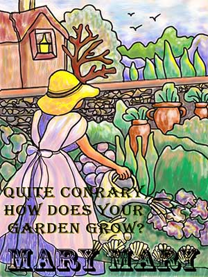
From the nursery rhyme the 1st paragraph of Mary, Mary, Quite Contrary is illustrated here. This painting is a digital drawing and painting of my own idea. I have tried to use colors and text that engage a nostalgic mood. Mary, Mary was quite the contrary miss, I think.
What started out as a cool idea and something nice to do on a quiet Sunday ended up being a 6 hour project….from the idea to the photoshop drawing and painting to the addition of text. I made 2 versions, one with text and one without. I ended up only listing the one version with text online.
What can I say except I love drawing like this and playing with text. When I moved from the U.S. I left all my fabulous books and films behind. For 40+ years, I had collected “primers” which in my collection, dated back to the 1880’s.
They were old beautiful books that I treasured and cherished. Primers were children’s elementary readers. Heads up on this one. The vocabulary, language in general was very sophisticated and advanced. I had a 5th grade reader which was equivalent to what would now be 1st year high school. There was no photography and dot printing had not been invented yet. So all the art was line art only. That is where I learned the fundamentals of drawing in grey scale by not using grey scale but using line art and the idea that drawing was an optical illusion. The width of the lines conveyed the tonal values. That led to my 30 years of drawing in scratchboard. I drew for over 25 years only in black and white and I am not ashamed to say it. I also learned about scale from primers. Think about this: Convey a mountain with a few people on top of it…don’t forget to include the clouds, the weather, the country, etc etc .then ask yourself if it conveys a mood as well as giving all that info? The storyboard was alive at the turn of the century for sure. All the rules and success of animation are in the old primers.
All of these principles have basically never changed. You become a better artist when you learn digital media because basically art is science. Photoshop and Illustrator are basically science and math is your friend. After one month of working hard and trying to remember my old skills, they are coming back. Now that I have the desire to use typography, this is just another icing on the cake.
Here is a product with this 100% digital art.
You must be logged in to post a comment.